If you recall, my hubby found this baby FREE on a curb! I was so excited for this project and had Really Big Ideas for it. So, I got to work.
First, I sanded the table using an orbital sander and also a sanding block. I started with the top, but since that's where my Impossibly Big Idea and Impossibly Big Ego were both shattered, let's talk about the base instead.
 The Base
The lovely angles of the base would not permit orbital sanding, so it was all done by hand. I just roughed up the surface, not bothering to remove ALL the old finish. I mean, it's only the bottom, so why bother? I also covered the brass plates with card stock, cut to size, to keep the paint off. Then I painted the base with a creamy interior latex, sanded the edges by hand for a "worn" look, and finished with my own homemade version of an antique glaze, which is basically dark-brown acrylic paint and water. I brushed this mixture over the white paint, then wiped it away, leaving a slight hint of the brownness behind for an aging effect. Beautiful.
And now, we come to the table top. The sanding went... (wait for it)... SMOOTHLY! The old finish practically melted off like butter on a hot corn cob. It was perfection! Then I did something really, really stupid. I did a stain/varnish combo in walnut. This, in itself, was not stupid. It actually turned out very pretty, especially after two coats (4-6 hours of drying time each) and a final clear coat over all.
 |
| Soap-paint was the only thing that even slightly transferred. |
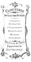
You see, I was planning to put a very elaborate French graphic (from the always-amazing Graphics Fairy) onto this table. I planned and measured it PERFECTLY. It took me hours of Photoshop work and looking up the French word for shoes on Google translator (chaussures), and then using the existing words in the same font to actually write the French word for shoes into the design. I thought I was very wise in planning for the extra table leaf, too, since the leaf could be removed, and the graphic would still look AWESOME, and the seams would match up to perfection! Clever me! Except for one fatal flaw: I cannot transfer this graphic onto the shiny slick surface of the table top.
 |
| SPLAT! |
 | |
| French graphic I was not able to use. (This time.) |
So, sans-graphic, this baby is ready to sell except for the fact that it has no chairs. Don't get me started about my quest to find reasonably-priced chairs, though. That is a blog for another day!


Steph, this is stunning!!! Absolutely beautiful.
ReplyDeleteThanks, Kathy! It sold QUICK, and I had two other people ask about it, LOL! Guess I need to do another one, eh?
Delete